April 23, 2026

Editorial Disclaimer
This content is published for general information and editorial purposes only. It does not constitute financial, investment, or legal advice, nor should it be relied upon as such. Any mention of companies, platforms, or services does not imply endorsement or recommendation. We are not affiliated with, nor do we accept responsibility for, any third-party entities referenced. Financial markets and company circumstances can change rapidly. Readers should perform their own independent research and seek professional advice before making any financial or investment decisions.
There's a version of this topic that reads like a press release, a ranked list of buzzwords, a few tool names, some placeholder statistics, and a CTA at the bottom. We're not writing that one.
I've spent the past four years in the middle of the design and development industry, working at Phenomenon Studio, a product design company that has shipped 250+ digital products across SaaS, fintech, healthcare, and edtech. In that time, I've watched the UI/UX landscape shift harder and faster than at any previous point in the industry's short history. Not because of hype, because of actual, measurable behavioural change in how users interact with digital interfaces.
In 2025 alone, we ran internal analysis across 38 product launches. We compared projects that integrated AI-assisted design workflows against those that followed traditional static design processes. The gap in delivery time, revision cycles, and first-month engagement metrics was significant enough that we've since changed how every engagement at the studio begins. I'll share that data, along with what we're seeing from clients who come to us after failed first attempts with other agencies, and what the leading AI technologies actually do for real products, not in theory, but in practice.
This guide covers the comparison, the best options, and how to actually choose. If you're evaluating tools, agencies, or both, read the whole thing. The FAQ at the end answers the specific questions we see most often from founders and product teams who've done some research but still aren't sure where to land.

What does it mean when a design agency says they use AI in their process?
It depends enormously on who's saying it. There's a spectrum. On one end, you have studios that have added an AI image generator to their toolkit and call that "AI-powered design." On the other end, you have teams that use AI at every stage, to simulate user flows before a single frame is designed, to generate and test layout variations programmatically, to build adaptive interfaces that change based on real-time behavioural data.
We sit toward the latter end of that spectrum, but honestly, even that comes with nuance. In my project work, the biggest value AI brings isn't in generating finished visuals, it's in the research and testing phase. When we use AI to model thousands of user paths before we begin visual design, we catch friction points that manual testing would have missed entirely, or catch six weeks later during usability testing. That's where the ROI is. Not in the generated output, but in the compressed time between hypothesis and evidence.
AI-driven UI/UX design, defined properly, means using machine learning and generative tools to accelerate and improve the research, design, testing, and personalisation stages of building digital products. It's not a replacement for design thinking. It's what happens when design thinking gets access to more data, faster iteration, and automation of the tasks that don't require human judgment.
38% Faster time to first testable prototype with AI-assisted design workflows (Phenomenon Studio internal data, 2025)
2.7× More layout variations tested per sprint when AI generation is in the process
34% Average drop in task completion time in products using intent-based navigation (Phenomenon Studio, 2025–2026)
$500M+ Total funding raised by Phenomenon Studio clients after product launches
Here's what I find interesting when I talk to founders who are evaluating design investments: most of them have heard of the major AI design tools, but very few have a clear picture of which layer of the design process each tool belongs to. They're not the same thing, and mixing them up leads to bad decisions.
There are four distinct layers where AI is making a real difference in UI/UX in 2026:
Different tools serve different layers. An agency that only uses layer-one tools (generation) without touching layers two through four is doing surface work. We have clients who arrived at Phenomenon Studio with beautiful, AI-generated designs that fell apart the moment real users touched them, because no one had modelled or tested the user journey before locking the visual direction.
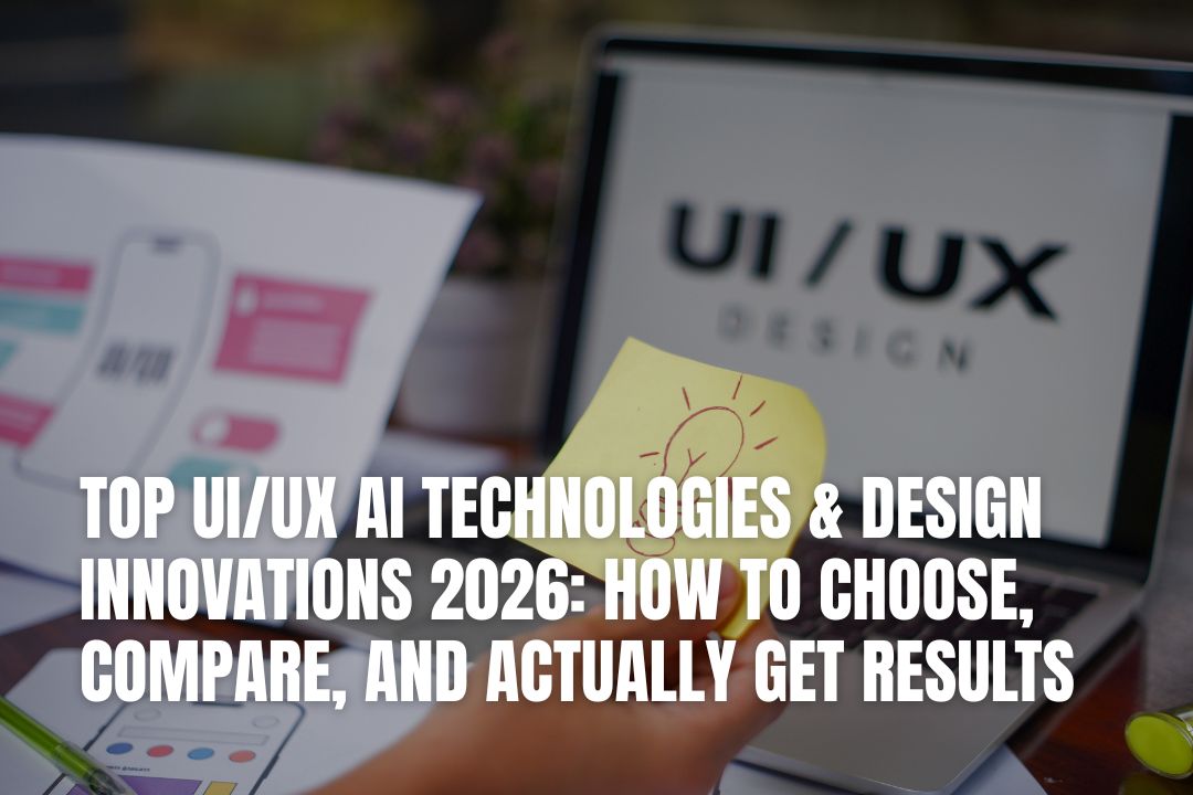
Which AI design tools are actually worth using in 2026?
There are a lot of them. "Worth using" depends on what stage of the design process you're in and what your team already knows. Below is the comparison we use internally when onboarding new project teams. I'll be direct about trade-offs; some of these tools have strong marketing but weak real-world utility, and vice versa.
A note on tool proliferation: We track which tools our clients are paying for before they come to us. The average company spending more than $50k/year on design comes in with 4–6 overlapping subscriptions covering roughly the same use case. Before adding another AI design tool, audit what you're already paying for and whether your team has the bandwidth to actually use it.
There's a design pattern that keeps showing up in the products getting the best results right now, and it's worth being specific about it because most articles on this topic describe it vaguely.
The shift is from static personalisation (you selected "marketing professional" in onboarding, so we show you the marketing dashboard by default) to contextual adaptation (the interface predicts your next action from the current session context and adjusts the available options in real time). The second model doesn't ask you to describe yourself. It watches what you do and adjusts accordingly.
We applied a version of this in a fintech platform we designed in late 2025. Users who were browsing investment options at a faster-than-average scroll speed, typically indicating comparison behaviour, got a side-by-side table view surfaced automatically. Users who paused on individual assets got depth-first content: charts, historical performance, and contextual news. Same product, same data, different presentation logic based on inferred intent. Engagement time increased by 28% without a single new feature being built.
In my project experience, intent-based navigation is the single highest-leverage design decision you can make for a complex product in 2026. The concept sounds simple: route users differently based on what they're trying to do, but implementing it well requires both strong UX thinking and a coherent data layer underneath.
Here's how we typically build it:
Most teams stop at step three and skip the last two. That's where intent-based navigation implementations fail, not in the concept, but in the testing and instrumentation.
Animation used to be the thing designers argued for, and product managers cut. That relationship has flipped in 2026. The data on motion design is now clear enough that leaving it out is the thing you need to justify.
Micro-interactions, the small animations that confirm an action, indicate a state change, or guide attention to the next step, reduce user error rates by reducing cognitive ambiguity. When a user submits a form and the button pulsates for 200ms before a success state appears, their uncertainty about whether the click registered drops to near zero. That 200ms has a measurable downstream effect on support tickets.
We now treat motion design as a functional specification, not an aesthetic choice. It's part of the design system documentation, with timing values defined in milliseconds, easing curves specified, and use-case rules written out for developers. When motion is documented like a component rather than vaguely described in a handoff comment, the implementation is consistent. When it's vague, developers fill in the gaps in whatever way is fastest to build, which is rarely what the designer intended.
We tracked this carefully across a cohort of 40 product teams we've worked with over the past two years. Teams that invested in a proper design system at the beginning of a product build, before the temptation to "just ship it and clean it up later", had an average design debt accumulation rate 3.4x lower at the 18-month mark compared to teams that skipped it. They also onboarded new designers in less than half the time, because there was a shared language to reference.
The calculation isn't complicated. A design system built once costs money upfront. Not having one costs money continuously, in inconsistency, in re-design, in developer re-work, and in onboarding. The problem is that the upfront cost is visible and the ongoing cost is diffuse, which is why teams keep deprioritising it. My honest advice: if you're building a product that you expect to touch more than once, build the design system on the first pass.
Challenge: AdFlux came to us with a marketing automation platform that their users described as "technically functional but painful to use." The campaign creation flow involved too many steps, the targeting options were too basic for modern audience segmentation needs, and the analytics were buried behind navigation that made real-time optimisation nearly impossible during an active campaign.
Process: We began with a UX audit and competitor analysis that covered HubSpot, Mailchimp, and Google Ads Manager, identifying where AdFlux was creating friction that its competitors had already solved. We then mapped the full user flow and ran structured interviews with 12 active users to understand which pain points were costing the most time per session.
What we built: A redesigned campaign creation flow with smart templates that cut the setup time from an average of 22 minutes to under 9. A real-time analytics dashboard integrated directly into the campaign view, eliminating the need to navigate away from an active campaign to check performance. Expanded audience targeting with granular segmentation by location, device, and behavioural interest. We built the entire UI on MUI (Material UI) as the design system foundation, giving AdFlux a scalable component library for their development team to work from.
Result: The redesign delivered a platform that their marketing users actually wanted to spend time in, with a measurable reduction in setup errors and a significant increase in advanced targeting feature adoption, which had previously been underused because users couldn't find it quickly enough.
I get asked this question constantly, and I'm going to give you the same answer I give founders who ask me off the record, not the diplomatic version.
Most agency evaluation processes focus on the wrong signals. Portfolio looks great? So does every agency's portfolio; they cherry-pick their best work. Have they worked with recognisable brands? Brand name recognition in the client list tells you the agency is good at sales. It tells you nothing about what working with them feels like at week six when the first research findings don't match the initial assumptions.
Here are the signals that actually predict good outcomes:
I want to spend some time on this because it's one of the most misunderstood decisions in digital product strategy. The default instinct when a website isn't performing is to redesign it. Sometimes that's right. Often it isn't.
We've had clients come to us for website redesign services who didn't actually have a design problem; they had a messaging problem. The interface was fine. The value proposition was unclear, the copy was weak, and the conversion path had friction that was strategic rather than visual. Redesigning the site would have cost six figures and not moved the conversion rate, because the problem was in what it said, not how it looked.
That's an uncomfortable thing for a design studio to say. But it's the truth, and it's why we do a discovery audit before recommending a full redesign. The audit includes heatmap and session recording analysis, user interviews (minimum five to eight participants), conversion funnel analysis, and messaging clarity assessment. Only after that do we recommend whether redesign is the right intervention, and if so, how comprehensive it needs to be.
Phenomenon Studio's 2026 portfolio, 250+ digital products shipped across SaaS, fintech, healthcare, and edtech.
Every year, a wave of design trend articles. Most of them describe what looks interesting, not what works. I'm going to describe what we've seen move real metrics in real products over the past 12 months, based on our own project data and a synthesis of published research from our industry.
Traditional onboarding is linear. You complete step one, then step two, and so on until you reach the "aha moment" that the team has identified. Adaptive onboarding changes the path based on what the user does. If a user skips a step, the system notes it. If a user spends extra time on a particular feature, the onboarding flow adjusts to deepen that exploration. If a user shows signs of frustration (rapid clicking, rapid back-navigation), the flow surfaces contextual help rather than continuing to the next step.
We built this for an edtech platform client (one of the Clutch-verified cases where Phenomenon Studio rebuilt a basic study tool into a personalised, AI-assisted learning platform). Adaptive onboarding was one of the core interventions that contributed to doubling student engagement in the first 90 days post-launch. The key difference from a static onboarding checklist: the product stopped treating all users the same and started responding to what individual users actually did.
The influence of spatial computing (Apple Vision Pro, Meta Quest, and the emerging AR layer on smartphones) is now visible in 2D web and mobile design, not in gimmicky ways, but in how designers think about depth, layering, and focus hierarchy. Products designed with spatial awareness in mind use subtle shadow, blur, and z-axis layering to communicate what's active, what's secondary, and what's in the background. This reduces cognitive load without requiring users to consciously process the information hierarchy.
It's a subtle shift, and it doesn't show up in screenshots well, which is why most discussions of it are vague. It shows up in how a user's eye moves through a screen and how quickly they locate the primary action. In our eye-tracking validation sessions, interfaces designed with spatial depth principles consistently outperformed flat interfaces on time-to-target metrics by 15–22%.
This is an underrated category. Typography in 2026 is no longer just about readability; it's doing functional work. Variable font animations communicate state changes. Text size hierarchies are being used as navigation signals, not just aesthetic choices. Kinetic typography in hero sections is being replaced by type that responds to user scroll behaviour, creating a sense of interaction with the content itself before the user has clicked anything.
We're cautious about recommending this to clients until we've validated that their user base has the device performance to render variable fonts and animations smoothly. A typeface interaction that looks stunning on a MacBook Pro renders as jank on a mid-range Android device, and 40–60% of most products' user bases are on mid-range Android.
"The most expensive mistake I see product teams make in 2026 is confusing design trend adoption with design strategy. We had one client come in with a 12-page 'design vision' document full of references to spatial computing, generative UI, and ambient interfaces — none of which their users had asked for, none of which had been tested. We spent the first three weeks of the engagement setting that document aside and doing the research that should have preceded it. The innovations that move real metrics are the ones that solve real user problems. The rest is interior decoration."
— Oleksandr Kostiuchenko, Marketing Manager at Phenomenon Studio | May 2026
This one comes up in almost every initial conversation we have with a new client, and the answer keeps surprising people: your brand identity and your UI/UX are not separate systems. They're the same system, and inconsistency between them is one of the most reliable predictors of low user trust.
A user who has a vague, modern-feeling impression of your brand from your website, then opens your web app and encounters an interface that looks like it was built five years ago by a different team, experiences a trust gap. They may not consciously articulate it as "brand inconsistency," but it registers as "this company doesn't have its act together." That's a perception that's hard to reverse once it's established.
We now treat brand identity and product design as integrated workstreams from the start of any engagement where both are in scope. Design tokens, the foundational values that define colour, spacing, typography, and motion, are defined once and shared between the brand identity system and the product's design system. The result is a product that feels like it's part of the same world as the company's other touchpoints, not a separate artefact built by a separate team.
If the answer to most of those questions is "not really," you have design debt that will cost more to fix the longer you wait. We've done this audit for clients who thought they had a brand consistency problem and discovered it was actually a documentation problem; the design decisions existed, but they weren't written down anywhere that the team could reference.
The line between design and code has moved significantly. It's worth being direct about where it is now and what that means for how you evaluate agencies and build teams.
In 2026, a professional UI/UX workflow almost always produces output that is closer to code than it used to be. Figma's developer mode, Framer's live-code output, and tools like Locofy that convert design files directly to React components have changed the expectation of what a "design deliverable" means. An agency that hands you a PDF of static screens is behind by several years.
The best agencies deliver design systems as coded component libraries, not just documented in Figma. They deliver interactive prototypes that behave like real products, not click-through mockups. They deliver specifications that are written for developers, not created as an afterthought.
This is our own research. We pulled data from 38 product engagements completed between January 2024 and April 2026. We defined "successful" as: product launched on time, core user metrics improved from baseline within 90 days, client relationship continued beyond the initial engagement scope. By that definition, 29 of the 38 were successful. We looked hard at the 9 that weren't to find common patterns.
The failures clustered around three root causes:
The 29 successes shared three consistent factors: a research phase that was protected from timeline pressure, a defined and documented definition of success agreed on before design began, and a project plan that treated design and development as a continuous process rather than sequential phases.
A note on offshore and outsource pricing: lower-cost offshore providers often quote these ranges at 30–50% below the numbers above. The trade-off is almost always in research depth, design system quality, and communication overhead. For highly specified, well-defined work with clear deliverables, offshore can be effective. For discovery-heavy, research-intensive work — the kind where the direction needs to change mid-project based on what you learn, it typically isn't.
The top AI technologies reshaping UI/UX design right now include generative layout engines (Figma AI, Adobe Firefly, Galileo AI), UX simulation tools (Attention Insight, VisualEyes, Predict by Neurons), real-time personalisation systems (Dynamic Yield, Optimizely), AI-enhanced behavioral analytics (FullStory, Amplitude), and multimodal interface layers that support voice and gesture input. Predictive UX, where the interface adapts based on inferred user intent, has moved from experimental to standard in well-resourced product teams.
Start with three filters: verified case studies in your industry, a documented research and testing process, and integrated design-development workflows. An agency that can't show you measurable outcomes from past projects, not just beautiful screenshots, is not giving you enough information to make a good decision. Check independent review platforms like Clutch and look for how the agency describes its failures, not just its successes.
Intent-based navigation is an approach where the interface layout adjusts in real time based on what the system predicts the user wants to do, using behavioural data, session context, and historical patterns. It reduces friction by removing irrelevant options and promoting the right action before the user has to find it. In our testing at Phenomenon Studio across 2025–2026 projects, products using this approach saw average task completion times drop by 34%.
UI design is what users see: visual layout, colour, typography, components. UX design is what users experience: the logic of flows, the structure of information, the emotional response to interactions. Strong products require both working together. When they're separated, a UX person doing wireframes that a visual designer then "skins", you often get interfaces that look polished but don't feel intuitive to use.
A UX audit runs $3,500–$12,000. A full website redesign is $18,000–$65,000 depending on complexity. A complete product design engagement for a new SaaS platform, from discovery through handoff, ranges from $40,000 to $130,000+. MVP design and development together typically falls between $70,000 and $250,000. Offshore providers quote lower rates, with meaningful trade-offs in research depth and design quality for complex, ambiguous projects.
A serious website redesign begins with a discovery phase, UX audit, heatmap analysis, user interviews, conversion funnel review, before any new design work begins. From there: new information architecture, visual design (responsive for all devices), component library creation, performance optimisation, and developer handoff documentation. Done properly, it's a 6–12 week engagement. Projects that skip the discovery phase and start with visual design almost always require significant rework.
A design system is a shared library of reusable components, design tokens (colour, spacing, typography values), and usage guidelines that keeps your product visually and functionally consistent as it grows. If your product has more than one designer or developer touching it, you need one. Without it, design debt accumulates at every sprint, our data shows teams without design systems accumulate 3.4x more design debt at 18 months compared to teams that built one at the start.
No, at least not at the level that produces real business outcomes. AI tools have made designers faster at repetitive tasks: layout generation, component resizing, first-draft copy. But the judgment calls, information architecture decisions, understanding why users behave as they do, navigating stakeholder trade-offs, still require human expertise. Designers who use AI as part of their workflow consistently outperform those who don't. The human layer remains the point of differentiation.
Verified reviews on independent platforms. Measurable outcomes in case studies (not just aesthetics). Clarity on which team members will actually work on your project. A defined research process they can walk you through. Honest conversation about past projects that went differently than planned. Agencies that can't or won't answer these questions directly are managing perception rather than demonstrating quality.
Offshore typically means working with teams in significantly different time zones, US to Southeast Asia, for instance, with limited real-time overlap. Nearshore means adjacent or overlapping time zones (US to Europe, US to Latin America), which enables synchronous collaboration during business hours. Quality can be high in either model, but nearshore tends to be better for projects requiring frequent feedback loops and collaborative decision-making. Phenomenon Studio operates as a nearshore partner for North American clients, with senior design and development capacity in Europe.
A UX audit: 2–3 weeks. A website redesign: 6–12 weeks. A full product design engagement (new SaaS or web app, discovery through handoff): 10–20 weeks. An MVP design and development engagement: 12–24 weeks. Projects that compress research to hit aggressive timelines almost always spend more time in revision cycles than they saved by rushing, net timeline is usually longer, not shorter.
Phenomenon Studio works across React.js and Next.js for front-end web applications, Node.js and Python for back-end services, Laravel for PHP-based platforms, full-stack JavaScript environments, Flutter and React Native for mobile, and blockchain development for Web3 products. The studio is a certified Webflow Professional Partner for no-code builds and holds HIPAA and GDPR certifications for healthcare and privacy-sensitive product development.
Everything I've written here points to the same conclusion, and I want to state it plainly rather than let it be inferred: design decisions are business decisions. The choice of agency, the choice of AI tools, the decision to invest in a design system or skip it, the choice to do research before visual design begins, every one of these has a measurable downstream effect on user behaviour, product performance, and business outcomes.
The product teams that understand this are building products that compound. Good design makes acquisition easier (first impressions convert), makes retention stronger (frustration-free products don't churn), and makes iteration faster (a well-structured design system means every new feature is faster to ship than the last). The teams that treat design as a line item to minimize are rebuilding at twice the cost 18 months later.
We've built over 250 products at Phenomenon Studio. The ones that performed best all had something in common: the design decision-making was treated with the same rigor as the engineering decision-making. That's the bar. Not a particular tool set, not a particular aesthetic, not a particular agency. Rigor. Evidence. Iteration grounded in real user behavior.
If you're at the stage of evaluating partners or tools, I'd rather give you a framework that helps you make a good decision than a sales pitch for one option. The questions in the FAQ above are the ones worth asking, of any agency, including Phenomenon Studio.