
April 28, 2024

Editorial Disclaimer
This content is published for general information and editorial purposes only. It does not constitute financial, investment, or legal advice, nor should it be relied upon as such. Any mention of companies, platforms, or services does not imply endorsement or recommendation. We are not affiliated with, nor do we accept responsibility for, any third-party entities referenced. Financial markets and company circumstances can change rapidly. Readers should perform their own independent research and seek professional advice before making any financial or investment decisions.
As many of you know, I speak on stages, coach business owners one to one, and write books that help people get paid properly for the value they bring. My focus is clear results. Over 20 years I’ve seen one pattern hold up across sectors and business sizes: people remember what they can hold.
That’s why I still lean on print.
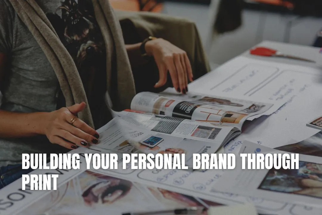
A simple card, a well made sticker, a workbook that clients keep on their desk for months these touchpoints do work that a fleeting post can’t. They turn a passing interaction into a lasting reminder, and they start conversations without you in the room. If you want your name to travel beyond a meeting or a keynote, give it something to travel on. With that mindset, the next step is deciding which printed pieces carry your message best and how to build them into your week.

Before you order a single sticker or card, sort your message. Mine is straightforward: I help owners get clear on price, product and process so their businesses become simpler and more profitable. If your message doesn’t fit on a small card without puff, it isn’t ready.
Once you’ve got that line nailed, choose two or three printed pieces that support how you actually work. I run workshops and a lot of face-to-face sessions, so my core set is business cards, a short leave-behind sheet, and stickers that land in the wild. That small kit gives people a quick reminder of what I do, a way to reach me, and something they might stick on a laptop or notebook. That’s the bridge from message to material, and it’s where most consultants should start.
A quick note on production partners here. I’ve had good results with specialist sticker printers who care about material quality and finishes. If you’re sourcing custom stickers, a reliable option is Jukebox Print. As a spokesperson from Jukebox told me, “We merge time-tested print craft with modern presses, and we care about sustainable stocks because clients want pieces that feel good and last.” That combination - durability, clean print, sensible materials - keeps your brand looking sharp in real life. With the partner sorted, design choices become easier and your materials do the talking for you.
Keep one side clean with your name and direct contact. Use the other side for a single line that states what you solve. Avoid buzzwords. If a stranger can hand your card to a friend and explain you in a sentence, you’ve nailed it. This card should get you a phone call, not a round of applause for clever design.
Stickers create visibility you don’t have to pay for every month. If your audience is founders and operators, chances are their laptops and bottles are covered already. If your sticker looks good and says something useful, it will join the mix. A tight logo mark, a short phrase your brand stands on, or a QR that lands on a short booking page all work. The goal is movement and memory, not a full brochure on a 2-inch circle.
This is not a catalogue. It’s a single page that explains your offer, who it’s for, and the first step to take. I print mine on sturdy stock so it doesn’t fold into a pocket and vanish. Hand it over at the right moment, then move back to the conversation. When you walk out, that sheet stays and does the follow-up for you.
From here you can add workshop workbooks, note cards, or a slim booklet. Start small, learn what gets kept, then add what earns its place in your bag.
If your website and your card sound like different people, trust drops. Match tone and keep sentences short. Replace jargon with words your clients use. I often read copy out loud to hear if it sounds like me speaking to a room of owners.
Same colors, same logo mark, same type. If your slide deck, site, sticker and card feel like one family, recognition builds with every encounter. That’s the compounding effect you’re after.
Thin paper curls. Cheap sticker vinyl peels. If your assets look tired after a week, people won’t keep them. Specify decent weight stocks, ask for samples, and test lamination for stickers that live outdoors or on bottles. If a piece survives a month in a rucksack, you’ve chosen well.
These rules turn your print into a reliable part of your system, not a box of stuff gathering dust near the office door. The more consistent you are, the less effort you spend on reintroducing yourself each time.
Place a stack of cards and stickers where people exit, and add a short call-to-action on a slide near the end. I often say, “If you took one useful idea today, grab the card and take one minute to book a follow-up chat.” Simple, polite, clear. A few stickers on tables helps too. People take them without feeling sold to.
I bring a small folder with the client’s name on a sticker, a note card for agreed actions, and a few extras for their team. It sets a tone of care and order. When your material signals that you’re practical and prepared, the meeting starts on the right foot.
Posting a handwritten note with a couple of stickers after a first session is an easy win. It lands two days later, makes the relationship feel human, and often prompts a warm referral. It’s not flashy. It’s just consistent.
If you attend a partner’s event, offer to provide co-branded stickers or a short printed guide that helps their audience. Done well, it positions you as helpful and makes the host look good. Everyone wins.
These placements meet people where they already are. You’re not forcing attention. You’re making it easier for the right people to take a next step.
The table below helps you decide where to invest first and how to measure whether each piece is pulling its weight.
Asset
Primary use case
Simple metric to track
Business card
Hand-to-hand at meetings and talks
Calls or emails within 14 days per 100 cards
Sticker
Ongoing visibility on laptops, bottles, notebooks
Social tags or QR scans per 200 distributed
One-page sheet
Leave-behind after meetings
Discovery calls booked per 50 sheets
Workshop workbook
Reference during and after sessions
Post-event actions completed per attendee
Thank-you note with sticker
Follow-up after first engagement
Referrals or repeat bookings per 25 notes
Event table tent or sign
Direction and call-to-action at venues
Scans or URL visits during event hours
This isn’t a lab. You’re just checking whether a piece helps people act. If a metric doesn’t move after a fair try, change the design or retire the asset and put budget into what does work. With a simple scorecard in place, we can talk about getting the details right.
On the back end, tag the links you share on printed items so you can see what came from stickers versus cards. Simple UTM tags do the job. The goal is to learn which touchpoints create action so you can do more of that and less of what ends up in the bin.
When your print assets and your site speak the same language, people move from hand to phone to calendar without friction. That’s the flow we want to build.
Here’s the filter to use every quarter.
If a piece scores well, I reorder. If it doesn’t, I redesign or pause it. I apply the same thinking I teach clients about product architecture: keep what sells, retire what doesn’t, and don’t let old material confuse new offers. With that discipline in place, you can scale volume or variety with confidence.
My career started in systems analysis at 18. I learned to fix bottlenecks and improve throughput. Later, I ran a design and advertising agency that served more than 250 clients. I taught workshops for over 1,000 owners on pricing, product and clear messaging. Across those roles, the principle stayed the same: reduce noise, increase clarity, and give people a clear path to act.
Print supports that principle. It slows the moment down just enough for someone to say, “Yes, I’ll book,” or “Yes, I’ll share this with my partner.” If you’re a consultant, coach or speaker who wants more of the right conversations, a handful of well made printed pieces will help you get there.
You should start with a core kit that includes business cards with a clear problem-solving statement, stickers that can travel on laptops and notebooks, and a one-page leave-behind that summarises your main offer. This small set provides maximum impact for a minimal investment.
To maintain a professional image, keep your design consistent with your online brand, using the same colours and fonts. Always choose high-quality paper and finishes. Working with a good printer who provides proofs is crucial to avoid disappointing results.
You can track the effectiveness of your print materials by linking them to digital actions. Use unique QR codes or simple, memorable URLs on your cards and stickers that lead to a specific landing page. Then, you can use analytics to see how many people visit from those printed items.
No, clarity is more important than quantity. Your goal is to spark a conversation or prompt a single action, not to provide a full brochure. Keep the text minimal, direct, and free of jargon. A single, compelling message is far more effective.
You should review your printed materials every quarter. Check if they still accurately reflect your current offers, pricing, and core message. If a piece isn't generating leads or feels outdated, it's time to either update the design or retire it.
